A/B Testing
A powerful way to improve the performance of website.
Project duration: 1 month at IUPUI

Project Overview
Objective
The objective of this project was to compare two versions of the website and check which works better statistically. In this project two versions of design – A and B was assigned to different set of people and the test results helped to determine which design served better to achieve the goal.

Design Context
To test which design variant works better for a specified goal, I applied this method to an e-commerce website which has introduced new features in their existing website and wants to check the design changes to attract more users in those sections.
Opencart, an e-commerce website introduced following features on their website to help users to save more and eventually adding to the business:
- Gifts sections
- Promotions section
- Menu bar changes from floating to fixed

Opencart original UI
Tools Used
There are several tools available to perform A/B testing, some of them are:
- Optimizely
- Google Analytics Experiments
- Visual Website Optimizer, etc.
I have used Optimizely for A/B testing for this project as it provides flexible ways to make the changes and test multiple variations without actually changing the source code.
Process
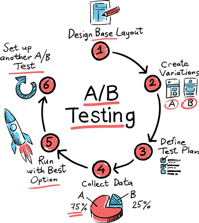
For this project, I created an initial hypothesis that existing product is not generating the desired outcomes. Changes to existing product sections might result in higher conversions. I made changes in different sections on the website and tested them against each other. I followed the steps shown in the figure below.
-
Set goals
- Increase the click conversion on Gift section.
- Increase page views of Promotion section.
- Improve navgation and visiblity of elements by fixing navigation bar position.
-
Create variations
- Changed Gift menu link background to Red and changed its font color to white.
- Changed the location of promotion banners.
- Changed navigation menu and header from floating to fix positioned at the top.
-
Define test plan
To test the changes, Optimizely divides website traffic for two variants. Original version A is called as Control and will receive 50% of the website traffic and Version B is called as Challenger which will receive other 50% traffic of the website.

Distributing traffic to test two versions of design i.e. A and B (Pic – Conversionxl)
-
Results
After running these tests for 1 month and 431 user visits to the website, following results are produced:
- 70% of the users clicked on new Gift section (Version B) with changed typography and only 30% of the users noticed old version of Gift section.
- Moving banners to the bottom of product carousel has increased user accessing these pages by 68%.
- For navigation menu change, statistics were ambiguous and does not provide any clear picture. In this case this test needs to be performed for a longer period of time to observe any big variation in data.
Reflection
Reflection 1 - Changed Gift menu link background from Gray to Red and changed font color to white.
As introduction of gift section has not attracted many users on this page, a variant of Gift’s menu link is made by changing background color to Red and font color to white. Click through rate (CTR) on the link is tracked for this change.

Design A – Original design

Design B – Modified design
Reflection 2- Moved promotion banners beneath carousel
Position of banners showcasing discounts is changed to bottom of the product carousel. Here transition of landing page users and their conversion of click is tracked.

Design A – Original design
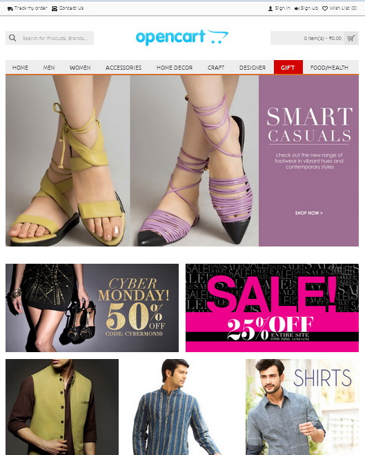
Design B – Modified design
Reflection 3- Changed menu bar position from floating to static-fixed
Changed design of header from floating to fixed. In this user’s clicks on navigation bar is tracked to understand the navigation issues in the website.
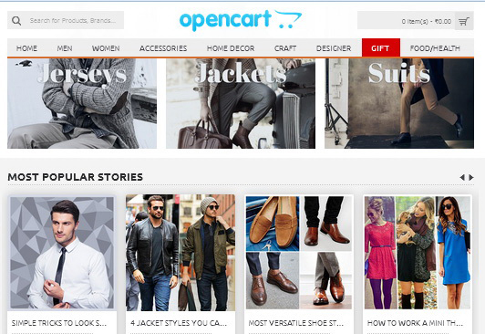
Design A – Original design

Design B – Modified design
Findings and Takeaways
- This evaluative method requires an existing product to test and user traffic to test the design changes.
- It will definitely tell you which design works fine but it will not tell you why that design performed better than the other variant.
- Duration of test would vary as statistic data collected could be ambiguous and data can vary depending on user mood, location, etc. One method can perform better for a week and other can outperform after that week.
- You have to make a hypothesis before making a design change decision thinking that these changes will work towards achieving the goal.
- Until confidence ratio is achieved for a goal you should not come to a conclusion for a best design choice.
- You should be able to know the right time to stop the test and conclude the results to implement the final changes.

