Knowledge Portal
A web platform to showcase the Roche GMI team's capabilities and communicate research findings and insights in an interactive way to the organization and translate them into learnings & opportunities.

UX Design Intern @ Roche
As a UX Design intern, I designed a Knowledge Portal for the team to showcase their work and share insights on a digital platform. Also, I conducted research with Certified Diabetes Educators and patients with Type1 and Type 2 to understand pain points in life with diabetes and find ways to make their lives better, eventually finding business opportunities.
The Problem
"We have a tremendous amount of research data but it is difficult to communicate the findings and research insights to the organization."
Portfolio Strategy & Global Market Insights (GMI) team have research data and insights which was difficult to communicate to the organization due to the following reasons:
- It is difficult to share UX Deliverables with the teams and stakeholders. Searching through files on a shared drive and emails is time-consuming and inefficient.
- Due to limited exposure to UX knowledge and processes, it was difficult to translate learnings into actions by different teams.
My Role
I lead the user research and experience design for the project. I collaborated with different teams to conduct qualitative research to understand how can I find a solution to the problem. Final deliverables included proper documentation of research findings, personas, information architecture, wireframes, prototypes, and visual design variants.
Understanding Business Requirements
Business challenge frame to understand business requirements, users and the pain points
I followed the elaboration process for identifying challenges and issues faced by the GMI team. The business challenge frame provided an actionable research hypothesis used to drive design research addressing the business requirements, pain points, and other dependencies.

Elaboration process helped me understand the business requirement and pain points in a better way. I used the business challenge frame to document the finisigns. Here are some important themes that I came up with after initial requirements:
- Improve GMI's visibility within the organization.
- Educate organization about user-centered design thinking.
- Simplifying access to the source of information and research insights.
The Solution
A web portal for GMI team which will help them to showcase their works and offerings to the organization. It should also provide a way for the team to upload documents and share them digitally.
Understanding Target User
Persona: Who are we designing for?
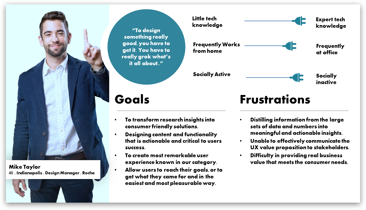
His current pain-point
"I find it difficult to find relevant document in time and communicate the research insights to the organisation."
How we want Mike to feel?
"It's easy to find and share reports and documnets. I can easily communciate insights and learnings to the organisation."
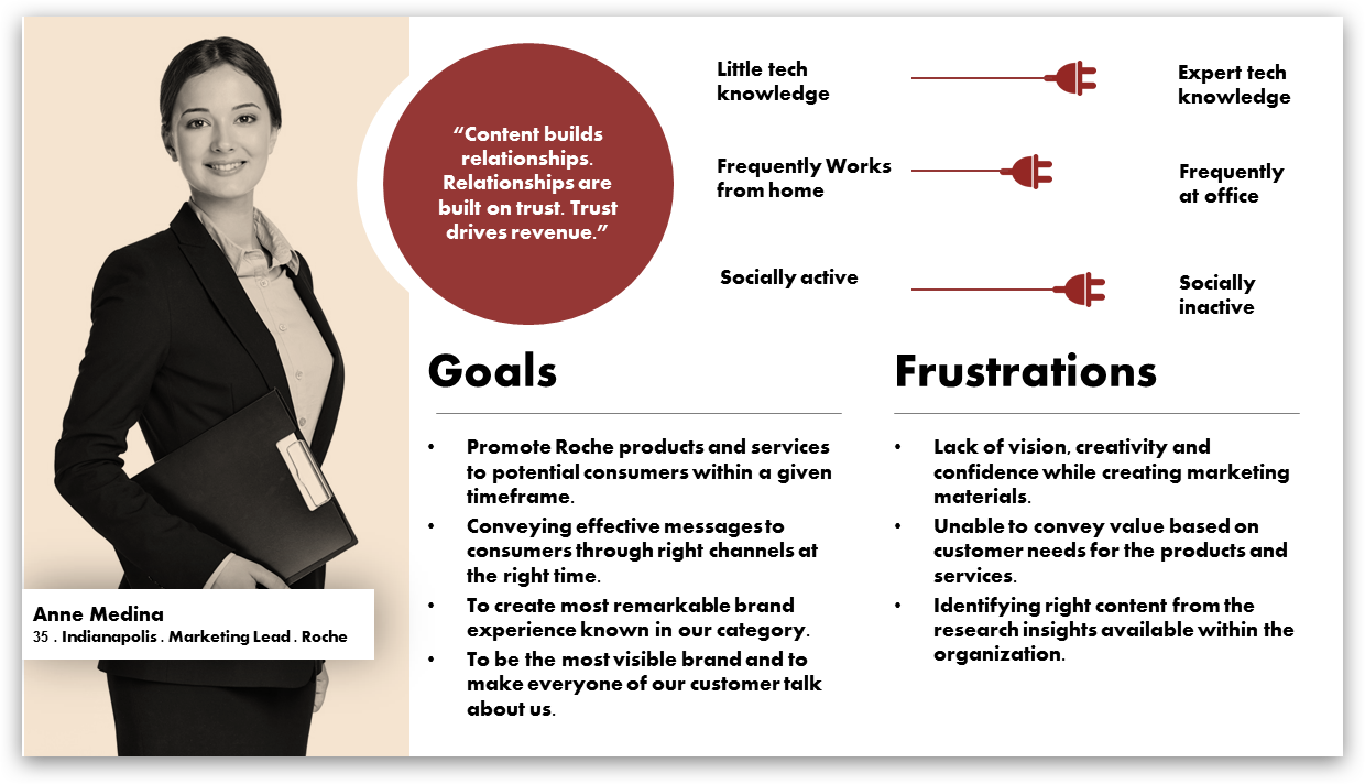
Her current situation
"I am not able to covey value of GMI team to the potential customers and stakeholders."
How can we make things easy for Anne?
"I am confident about the work GMI team is doing. I can find research materials and documents effectively."
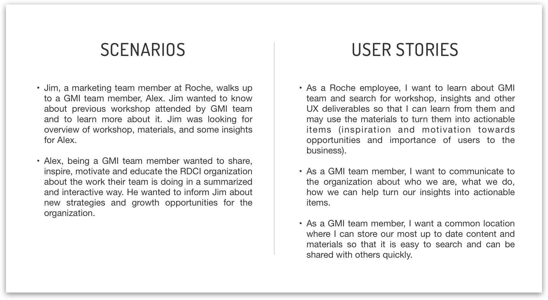
I took the voices of Anne and Mike, uncover their core need and turned them it into Scenario and User Story
Ideation & Brainstorming
Sketching initial ideas
I conducted brainstorming sessions with the team to come up with interesting ideas on how to represent the team in front of the organization. I also created several paper prototype screens and skecthes of ideas discussed during interactive sessions.

Concept Mapping
I came up with three concepts capturing the key essence (value proposition) for designing the knowledge portal. I wanted to determine which one meets the needs of the target audience more closely. The three concepts are:
- Portal introducing GMI team and services.
- Portal promoting GMI team and empowring learning of UX materials.
- Portal with introduction of GMI team and facilitates learning to turn insights into actionable items.
How to present information to Mike and Anne
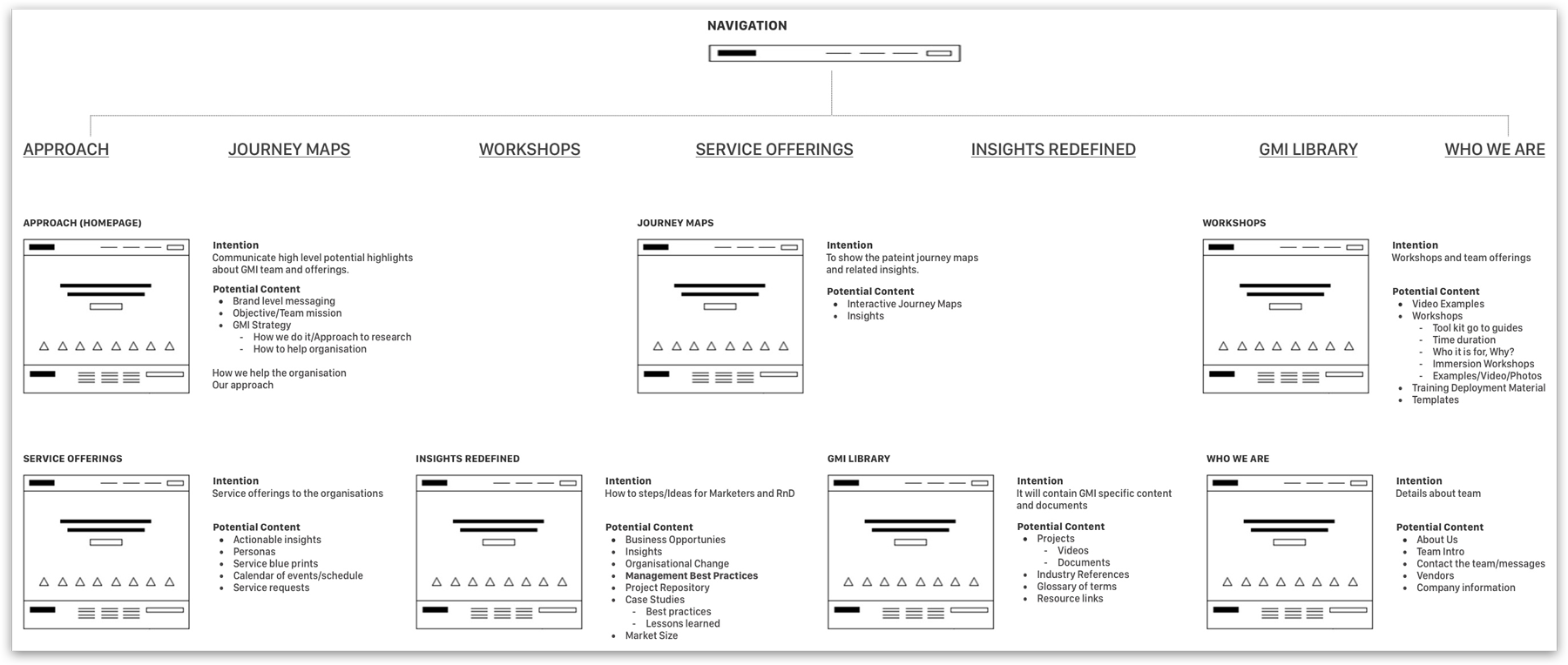
Information Architecture v1
I created an initial version of information architecture based on the research data collected and the user needs for the Knowledge portal.
Card Sorting : Validating Information Architecture
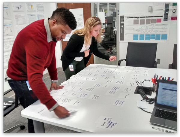
I conducted an open card sorting exercise to validate the initial information architecture of the portal. This exercise helped me define and structure the information for the users in more efficient way.
Information Architecture v2
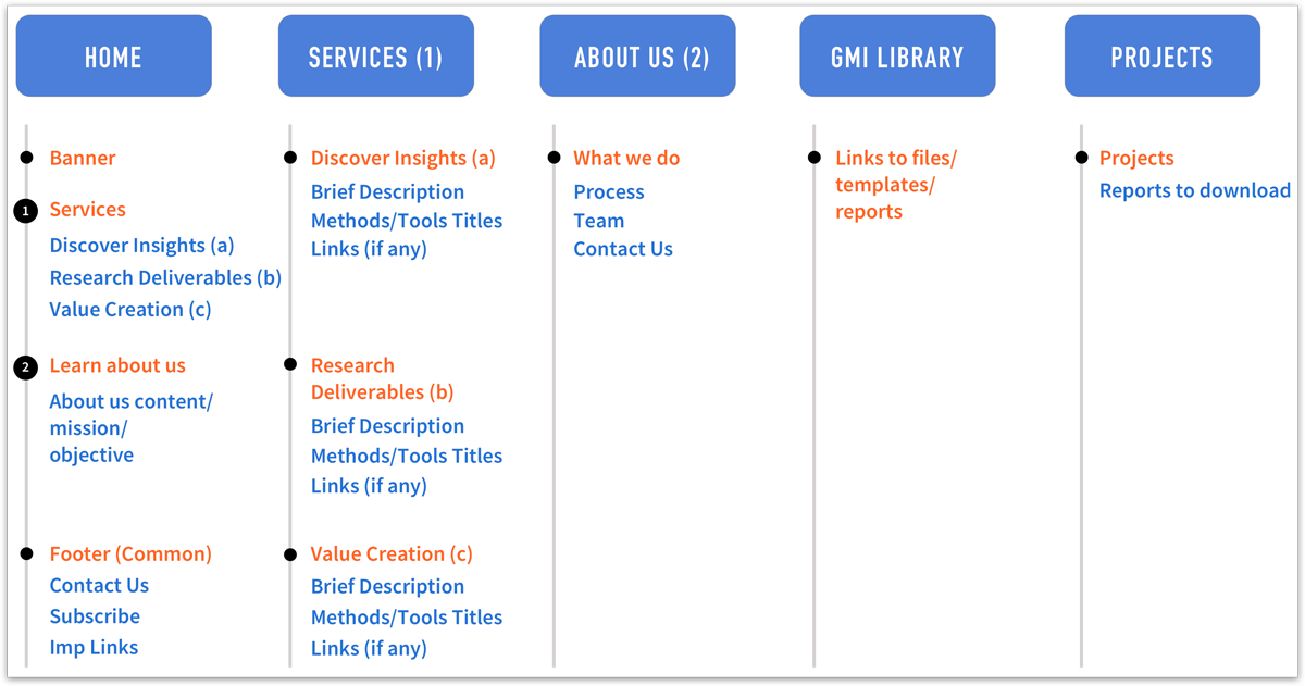
I created a revised version of IA from the takeaways from the card sorting exercise. The updated user environment diagram helped create an understanding of the different options we would provide to Mike and Anne at different stages of interaction with the portal.
User flow diagrams
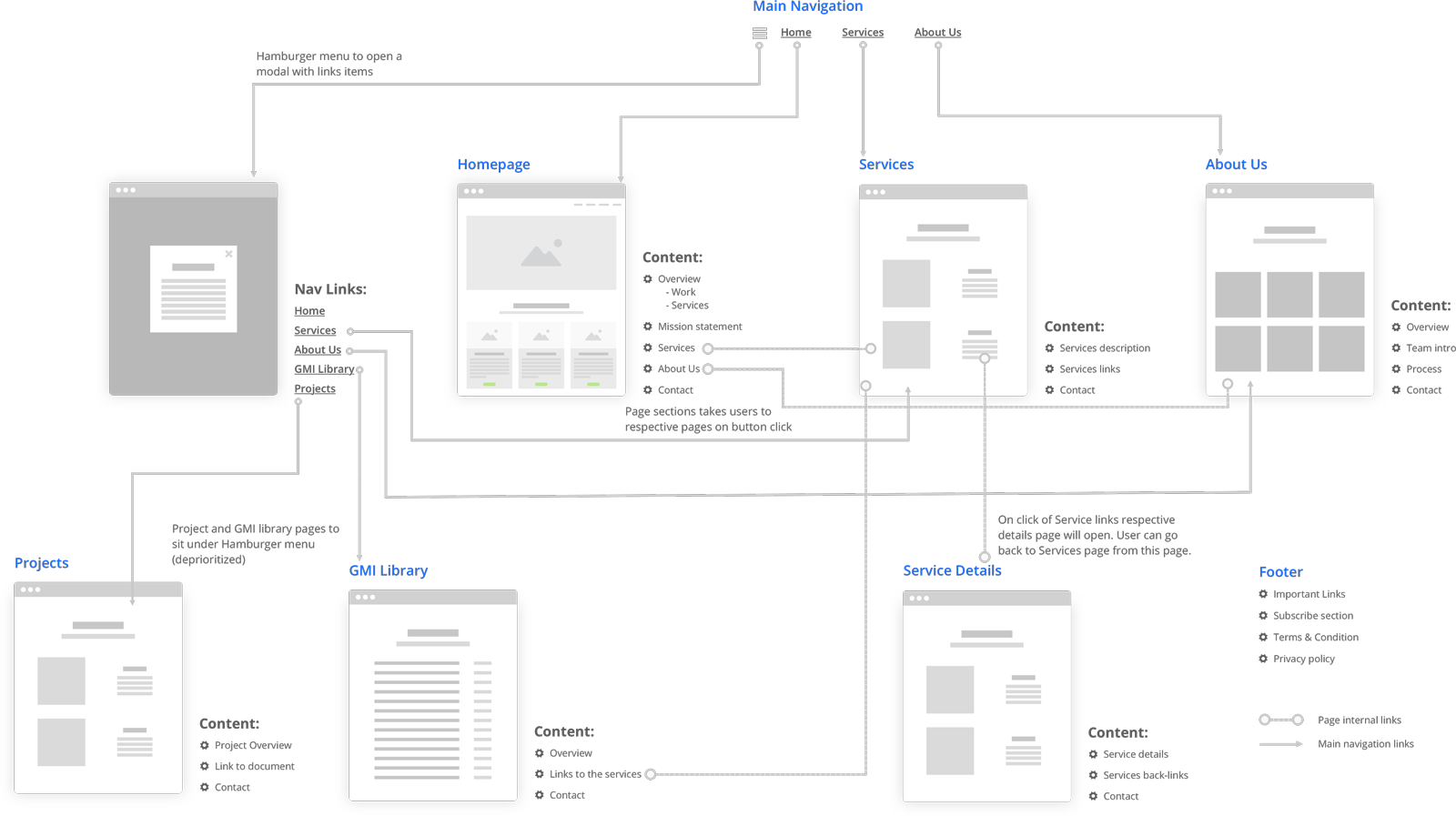
I created user flow diagrams for single page and multi-page variants.
User flow for single page variant

User flow for multi-page variant
Exploring solutions for user needs
Wireframing
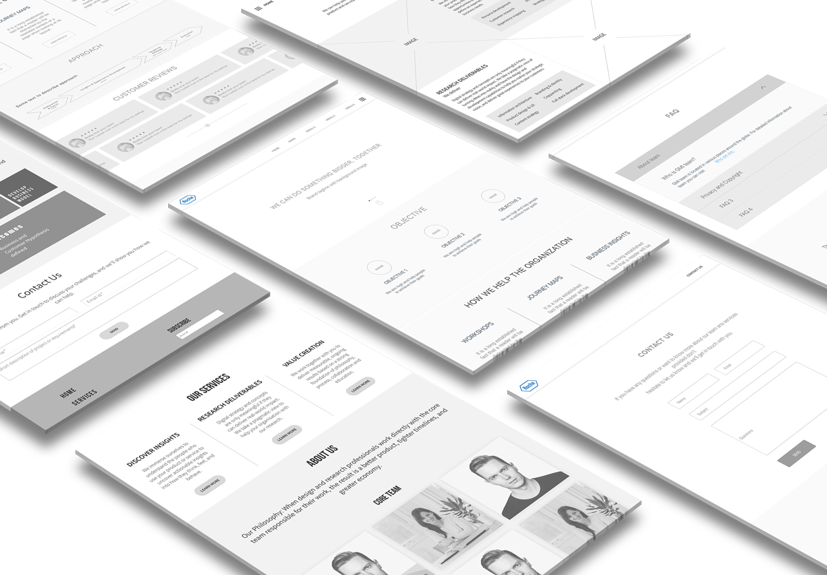
I sketched several ideas and put them into initial wireframes to find how these solutions address the major user pain points from the user research. There were two themes that emerged from the ideas:
- Providing a central location for Roche teams and individuals to find insights and learnings from foundation studies.
- Providing a platform for making teams familiar with the GMI research approach and services.
Prototype
After initial exploration wireframes, I started consolidating the design by making the prototype of the knowledge portal. During this phase several iterations on user flows and design took place. I explored and designed two versions of prototype exploring different user interactions and navigation patterns.
- Multiple page variant
- Single page variant
Here are some design decisions:
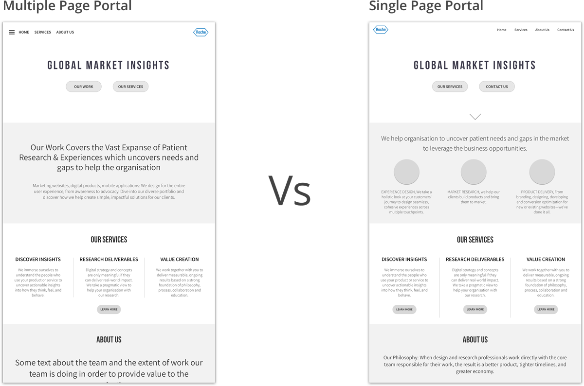
When a user enters the knowledge portal we will show them information about the GMI team and their services. It will act as a promotional landing page. Two UI patterns can be used -
- Multiple page portal, exploring the breadth of work, projects, and services. This version allows user to hold in the information in memory while they explore the portal. This is increased cognitive load for the users.
- Single page portal, showcasing GMI team and their services. This provides infomration holistically with minimum cognitive load but restricts users with knowledge and information.
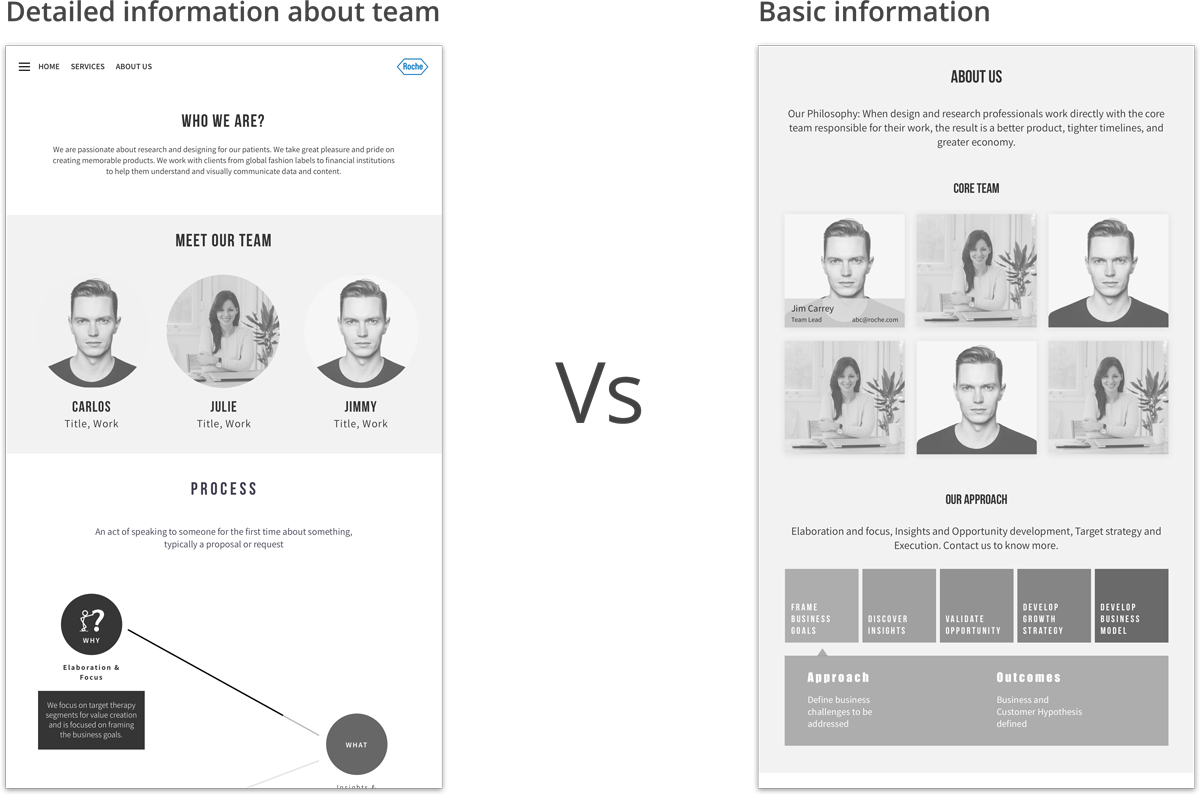
To know more about the team we can provide two ways to do that -
- Separate about us page for the team. This allows us to add additional details about the team and is easily scalable.
- Brief information about team allows users to focus only on relevant information.
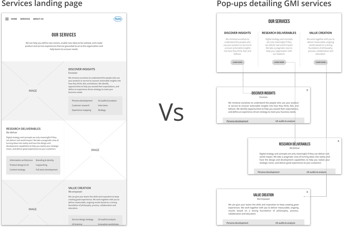
One of the major pain point was inability of the team to promote the services and offerings to the organisation. There are two approaches by which this can be addressed -
- Detailed services with samples and templates of UX materials can be used. This encourages users to learn and apply the knowledge in their projects.
- To promote the services in an efficient way, a brief information detailing the services can be used.
Visual Explorations
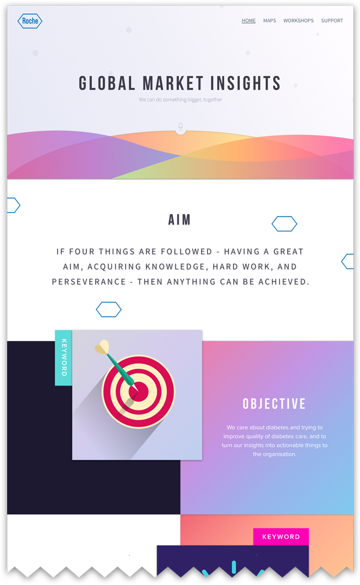
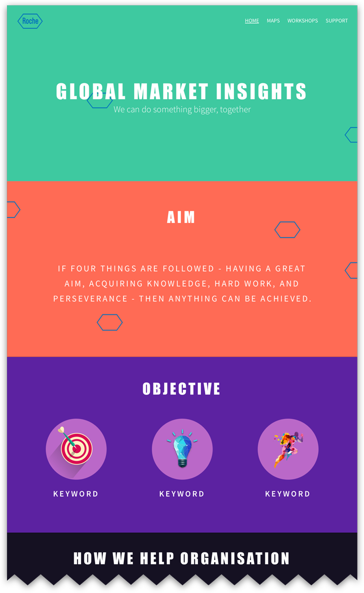
I designed two variants of the landing page based on the initial findings and to test how different visual style guides the mood of the users within the organization. I used two different styles for the portal. For the final version of the portal team decided to move ahead with multi-page variant and visual style to follow wave-patterns.
