Dress Me
Application which allows users to manage wardrobe and provide suggestions and feedback from friends on the fly. It helps them to check which combination suits better for what occassion.

Overview
About the project
In this project, we designed a "Dress Me" application aimed at solving problems for users who seek opinions and suggestions about selecting clothing and accessories. This app will help users make informed decisions about their clothing choices which eventually save time, money and efforts.
The Problem.
- Time - Users spend a lot of time working on their appearance every day.
- Money - Users waste money on fruitless clothes and accessory shopping.
- Trust - Users have trouble trusting people to give them helpful feedback.
The Solution. An application that can store and manage wardrobe collection and provide suggestions based on occasions and events to the users. It should create an ecosystem where users can share photos and ask for feedback from people whom they trust and seek opinion, eventually making the process time efficient and effective.
My Contribution
- Observations and Interviews
- Interaction Designing
- Storyboards
- Prototyping
- Visual Designing
- Usability Testing
Tools Used
- Illustrator
- Sketch
- Photoshop
- Paper
- Pencil
Team
- Anurag Goyal
- Tiffani Stuart
- Leesha Patel
Duration
1 month
User Research
Contextual Inquiry - Observations & Interviews
We conducted a contextual inquiry on users in shopping malls and their house to discover what users do and how they perform the selection and decision-making process. We observed people behavior, took notes, asked questions parallel with observations then we analyzed the data for an informed decision.
We learned several things, interviewees indicated a strong need for opinions they could trust. They also expressed their unending struggle to balance their time and maintain their appearance. Additionally, they desired an easier way to save money, without having to invest gross amounts of time they didn’t have.
Synthesizing Data
Affinity Diagramming
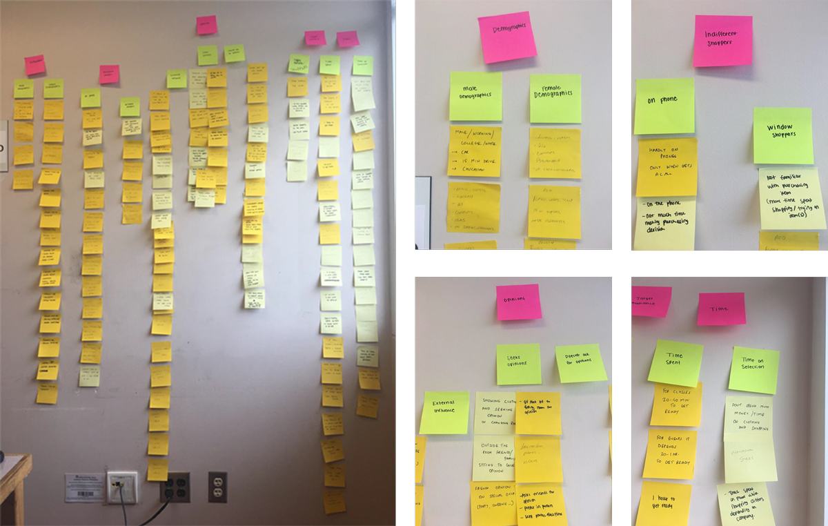
Affinity Diagramming and Interpretation Sessions helped us to generate insights from the data collected. We came up with following themes:
- Demographics. Captured male and female demographics during field visit.
- Indifferent Shoppers. Showed diffetent behavior while shopping.
- Opinions. Who seek or doesn't seek opinion from others.
- Time. Time spent on selecting clothing/accessories.
Understanding the user
Personas
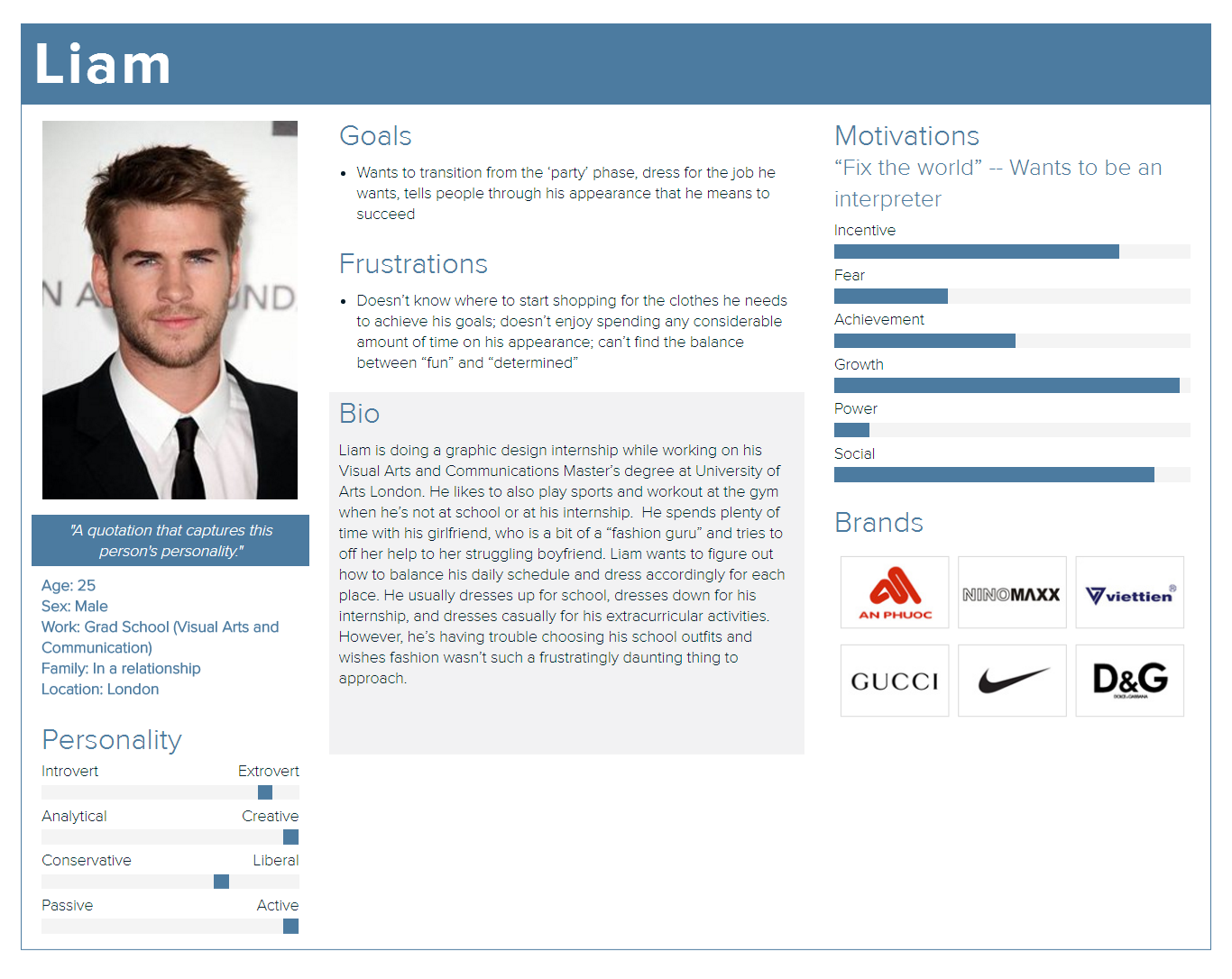
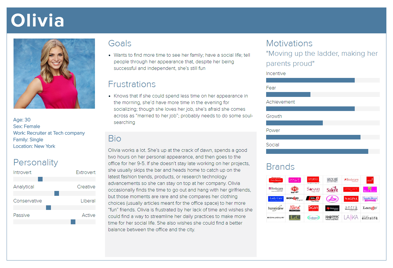
I created two personas, Olivia and Liam representing a significant portion of people in the real world and enabled us to focus on a manageable and memorable cast of characters, instead of focusing on a number of individuals we came across during our observations and interviews.
Empathy map
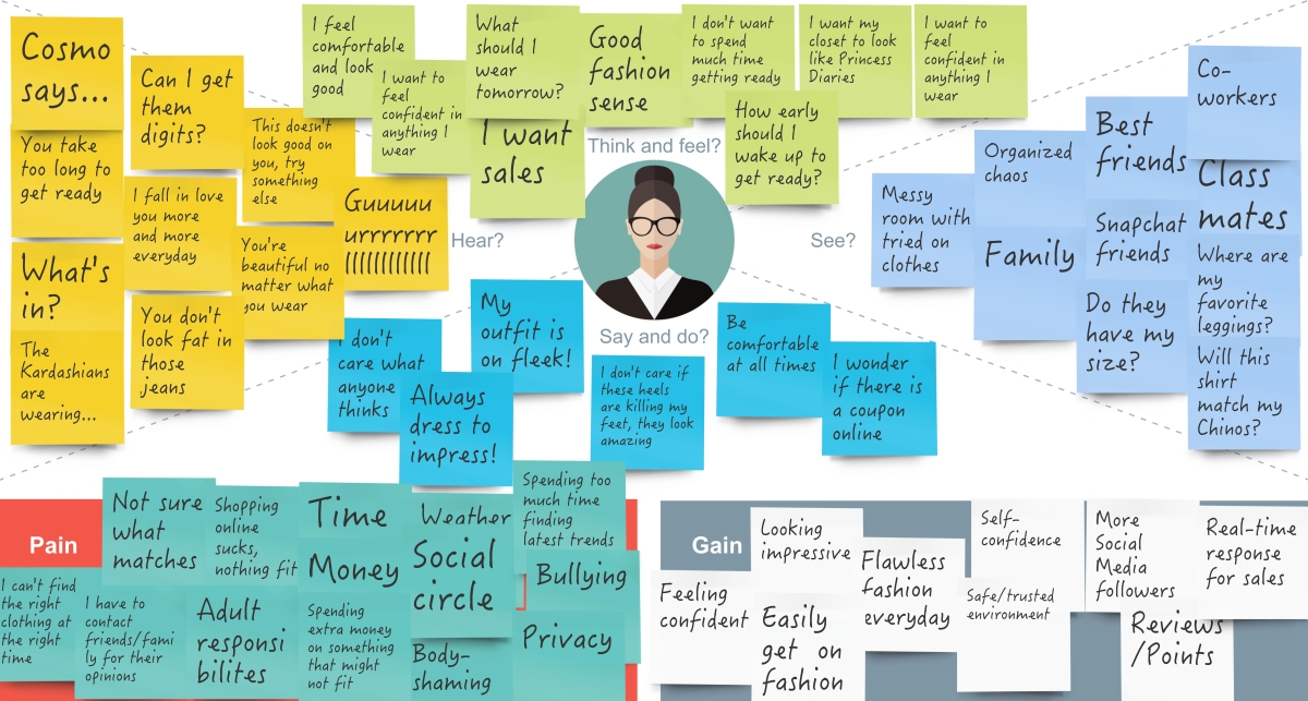
Empathy mapping is like an emotional mimicry and the people we observed and interviewed can be best understood and expressed through this mapping technique. It helped us to empathize with the users. People do care about their appearance, at least they want to look good and confident in whatever they are wearing. So breaking things down into different categories like what they feel, what they see, what they are gaining, etc helped us to understand the user requirements and pain point in a better way. It’s like feeling what one takes another person to be feeling.
Ideation and Brainstorming
Storyboards
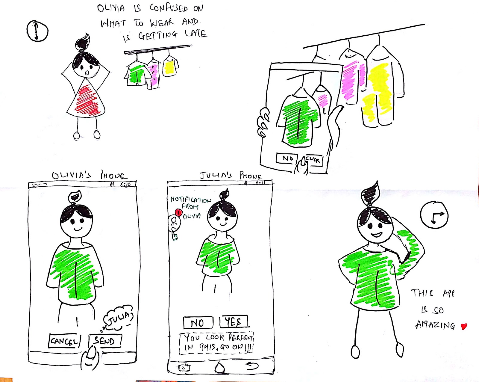
This storyboard shows how Olivia is confused on what to wear for an event and is running out of time. She uses the application to click pictures of her cloths in the closet and the application demonstrates those cloths on her body. She sends it to her friend; Julia for suggestion and she will recommend the one which best suits her. Now Olivia is ready in for the event without wasting much time on deciding on what to wear.
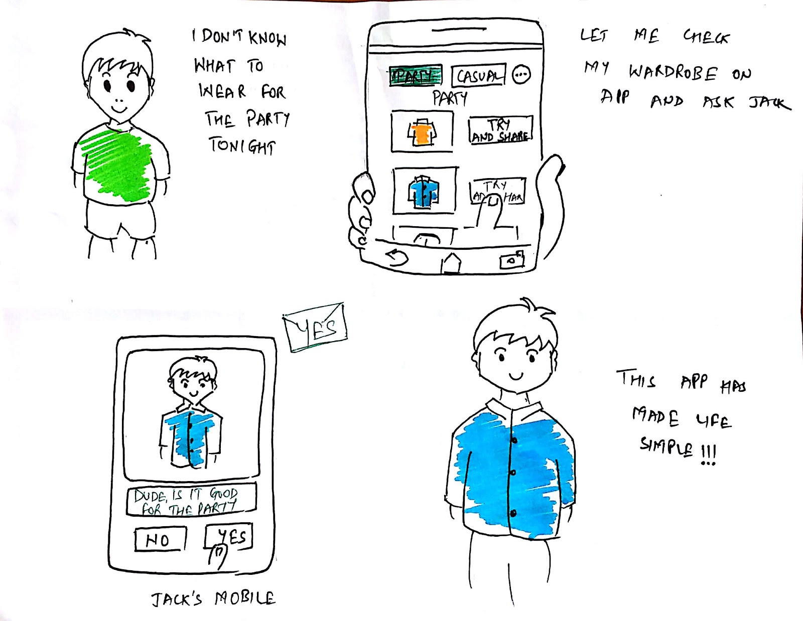
Liam has to attend a party and he is not sure what to wear. He uses the application to select the occasion from the list of occasion displayed on the app. He selects party and list of recommended cloths from his closet is shown. He selects one and shares it with his friends to ask for suggestion. Now he is ready for the party.
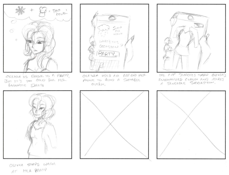
Olivia is confused on what to wear for the occasion and the weather is not good. She checks the application for suggestions based on the weather condition and occasion. She finally selects the outfit and leaves for the occasion where there are changes of cold weather
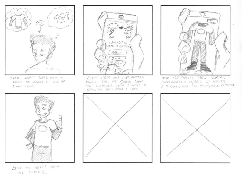
Liam is not sure what to wear and want to select outfit based on the weather. He checks the application and clothes suggestions based on the weather conditions.
Bringing ideas to life
Interaction flow and Wireframing
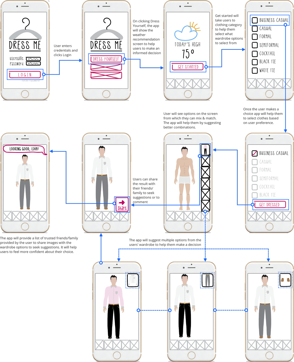
I sketched out ideas and flow of the screens then I created quick wireframes to test the ideas and validate the interaction flows. Here are the interaction flow and the wireframe screens.
Lo-fidelity Prototype
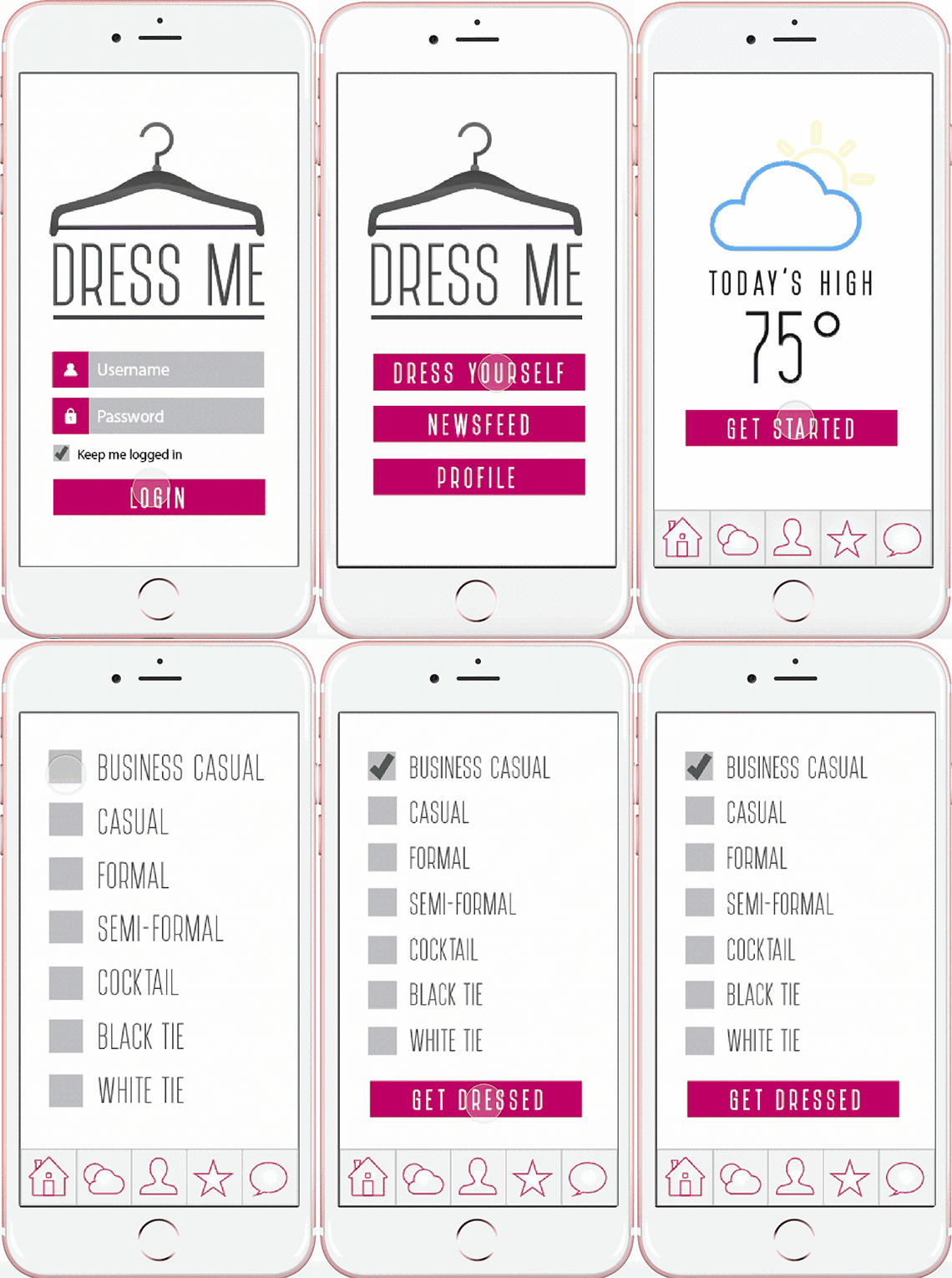
I added some details to the wires and created a low-fidelity mockup for user testing. As this project was meant to validate ideas and interactions quickly we assumed that the user has already signed for the application and have added wardrobe collection to the app. Below are some user interactions and their significance.
Helping users to make an informed decision
To help users make an informed decision about dressing, the app informs the user about the weather for the day after they login to the app. It also provides clothing type options to help users filter wardrobe based on their preference.
Wardrobe selection and feedback from people they seek opinion from
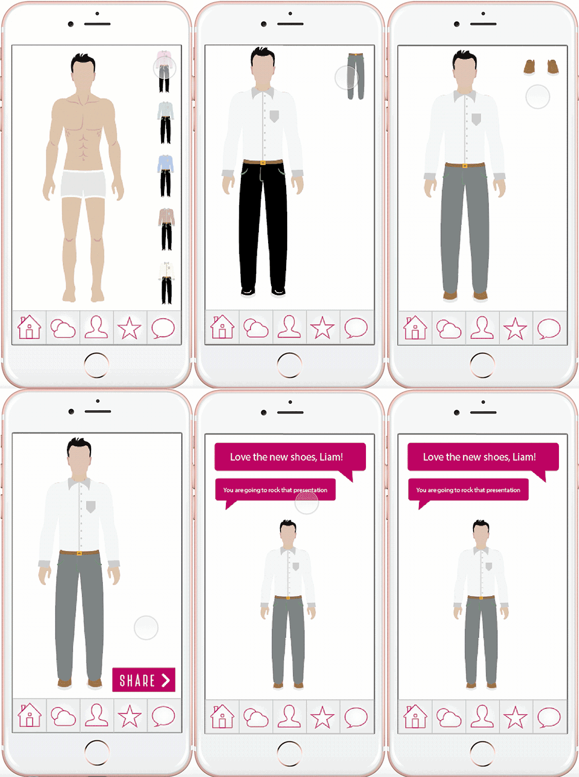
The app provides users with clothing suggestions based on their preference and wardrobe collection. The user can share the image after making a combination to seek an opinion. It will help users to feel confident about the choices and will save overall time.
Retrospection and Lessons Learned
Prototyping Methods. We chose to create a low-fidelity paper prototype in Adobe Illustrator. The program is easy to use and streamline. We used it to create a prototype that was both unfinished, but still aesthetically pleasing. An additional advantage to Illustrator is the ease with which we were able to make changes to further push the prototype to achieve the high-fidelity version.
Prototyping Experience. We felt that the paper prototype worked well enough for this project. It was easy to develop and approachable for our users and to test different ideas on paper before delving into high-fidelity prototyping. We did find that tools like MarvelApp, however, was easy for us to use and believe that such tools should be utilized going forward with higher fidelity prototypes.

