Glancer - Tinder for Jobs
A gesture-based job search application, addressing notorious UX pain points and providing a quick and easy way to browse through job postings and apply to them.

Overview
About the project
The Problem. Searching and applying to a job is time consuming and tedious process. Job seekers have to perform the same steps for several applications and often lose track of job applications to which they applied to.
The Solution. We designed a mobile application, Glancer, which is capable of expediting the job search and application process with the use of simple gestures. The features like bookmarks and history make this application more user-friendly.
My contribution
- Contextual Interviews
- Storyboards
- Sketches
- Competitive Analysis
- High-Fidelity Mockups
- Interactive Prototype
- User Testing
Team Members
- Anurag Goyal
- Onkar Borgaonkar
- Sisi Jin
Tools Used
- Invision
- Sketch
- Balsamic
- PhotoShop
- Illustrator
Design Process
-
Empathize and Define
Conducted contextual inquiry, interpretation sessions, model consolidation and affinity diagram
-
Ideate
Visioning sessions
-
Prototype
Storyboarding
-
Test
Paper prototypes and user testing
User Research
Contextual Interviews
We started with Contextual Inquiry on applicants seeking UX Designing Job using web portals. The interviews were conducted at participants workplace. We collected field data through semi-structured interviews and observations about their work, life and search patterns to better understand the pain points.
What did we learn from CI? (Major Insights and Takeaways)
- Portals with custom alerts based on job title, location and country are preferred.
- 40-50% of the jobs available on portals redirected users to organization's website where they fill out redundant information.
- Multiple websites were used and users faced issues keeping track of applications.
- Liked portals which showed jobs listings without signing up.
- Response time from companies about their application ranged from 2 weeks to several months.
Problem Synthesis
Affinity Diagramming & Interpretation Sessions
Affinity Diagramming and Interpretation Sessions helped us to generate insights from collected data. Four major themes were discovered during this session: portal & features, applicants profile & skills, making process easier, and facilitate communication.

Work Models
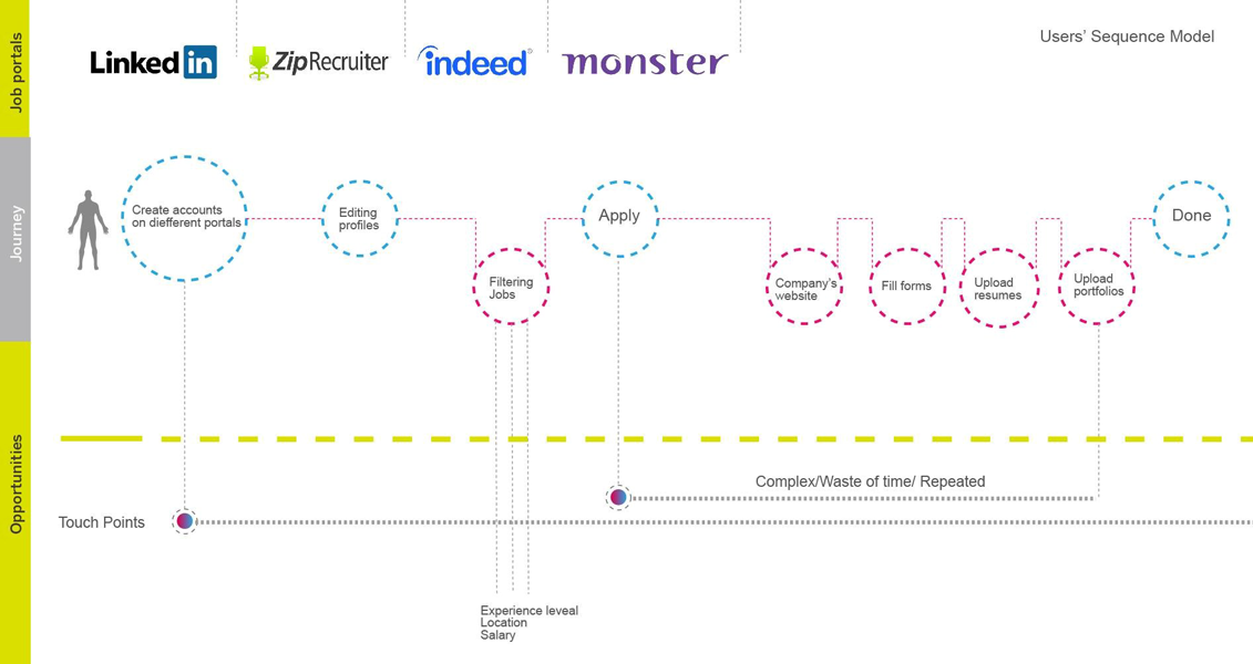
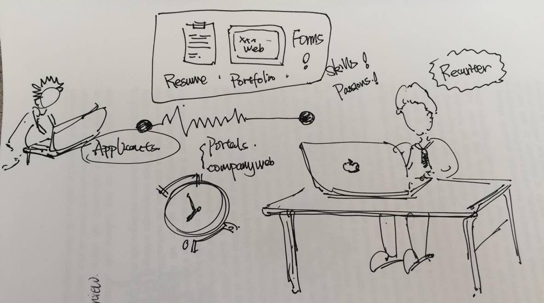
We created sequence and relationship models. These models provided better picture of user needs and issues faced by our participants while interacting with the system and applying to jobs. These diagrams helped us visualizing user journeys, system's functionality, boundaries, artifacts and influences, identifying user-interface requirements — as well as opportunities for further UX involvement.
Ideation and Brainstorming Sessions
Whiteboarding
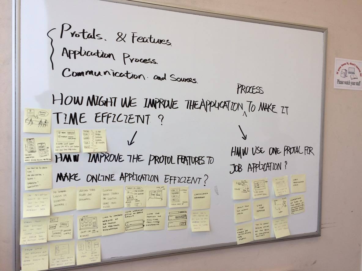
I conducted several whiteboarding sessions to ideate potential solutions targeting user pain points. After our sessions we decided to concentrate on the following themes:
- How to improve job application process to make it efficient?
- What are the opportunities and features which can be improved in portals to make users experience better?
- How can we make a single application which cater major user issues and smoothen the application process?
Visioning
The major issue users faced in application process is time and repetitive process. To tackle these issues we came up with the following potential systems:
- Efficient and accurate job results and information - Using QR codes
- Improved job application process by eliminating repetitive/irrelevant steps - Jobify (Finally changed name to glancer)
- Improved data filling process - Auto-fill plug-in and search within plug-in for job match.
Storyboarding
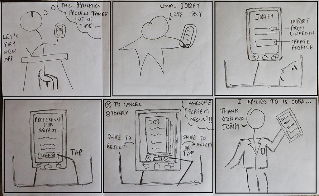
After filling all the important details about the job search, the applicant swipes the search results in order to apply or reject a job posting. When applied, the recruiter receives the candidate profile and applicant also receives notifications.
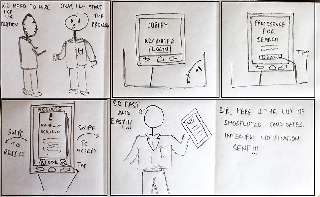
The recruiter receives a list of applicants who have applied for a certain position. The recruiter can view the applicant details and simply tap on the appropriate button to accept or reject the applicant.
Design
High Fidelity Design Screens
I created style guides for the user interface and established typography for the high fidelity prototypes. Some of the major screens of the app are shown below.
Login and Onboarding
- Login and Sign up. Users can log in either by using their LinkedIn credentials or by signing up with email. Using LinkedIn credentials will help users to import their profile details which will save time and efforts.
- Profile Import. Users can import their details from the LinkedIn profile which provides immediate value and save their time of duplication.
- Guidance and Learnability. We provided visual cues to guide users on how to use this application and enhance the perspective of the services.
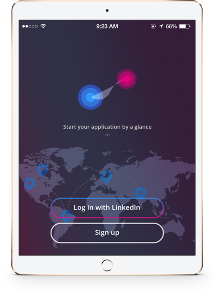
Login and Sign up
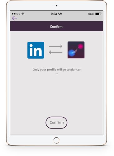
Profile Import
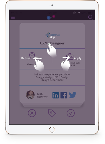
Guidance and Learnability
Swipe Features
- Refuse or Reject. If users are not interested in a job posting they can swipe left to refuse it.
- Skip. Swiping upwards allows users to skip a job posting which after skipping goes back to the job postings loop.
- Apply. When users are interested in a job posting and wanted to apply they can swipe right. When they apply their profile information goes directly to the recruiter.
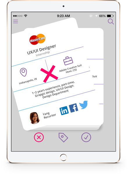
Refuse or Reject
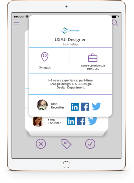
Skip
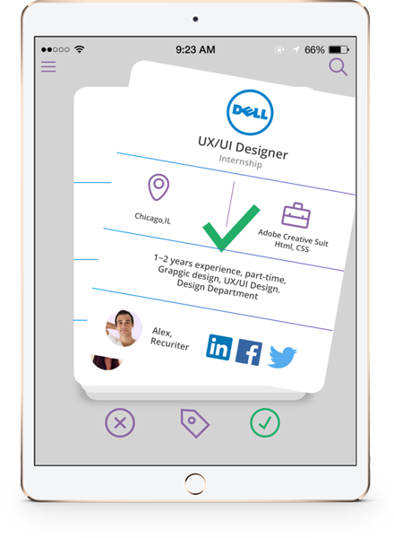
Apply
Other Features
- Bookmark. Users can bookmark a job posting which will help them quickly access the job posting in future.
- Messages. Once there is a recruiter-applicant match, they can chat and exchange messages. It provides a way for a direct and quick contact.
- History. History section maintains a list of events and actions performed by the user. It provides an easy way to go through applications to which user has either applied, refused and got an approval from a recruiter.
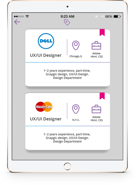
Bookmark
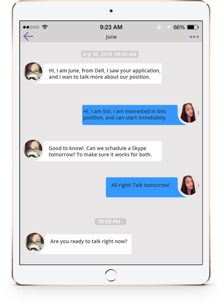
Messages
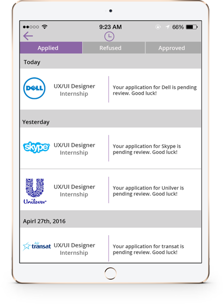
History
Retrospective and Lessons Learned
- The time frame for the project was very tight and if we would have gotten more time, we could have spent more time interviewing and observing more teams to gather as much as data as possible.
- If we had more time we would have interviewed more recruiters and designed an interface from a recruiter point of view as well. This might have changed the way users interact with the current prototype.
- I feel there are several products available in the market which have potential but due to bad usability, they are not famous as we found during our competitive analysis phase.
- This project also allowed me to work with a different team and integrating ideas from other teammates.
